This commercial real estate firm had recently changed ownership and acquired a new name. The CEO wanted branding that was modern and edgier than their more established competitors.
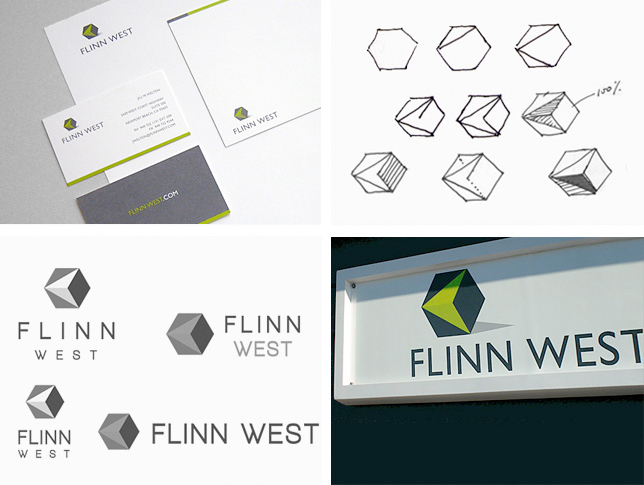
We incorporated a cube motif to signify spatial structure and square footage—both important attributes of commercial real estate property. The arrow is a nod to their Left Coast location. Application: website, signage, stationery,


